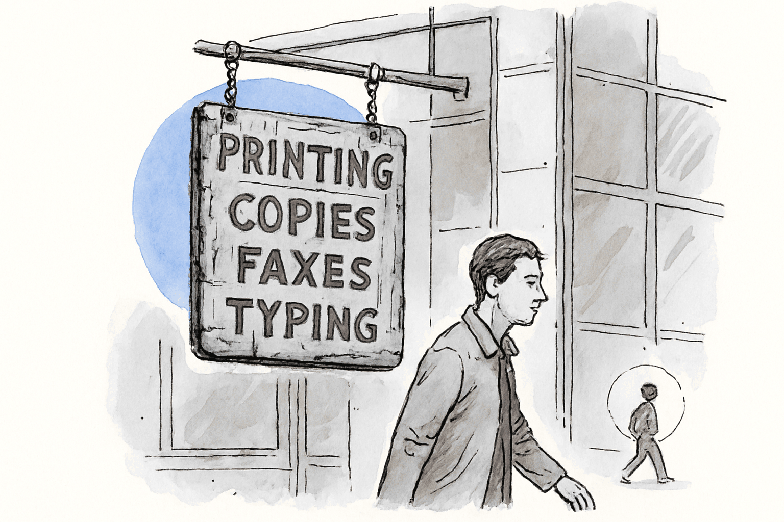
Last year I was doing an audit for a company that had been in business for about fifteen years. Solid reputation, consistent referral flow, the kind of firm that stays busy because people in the industry know their name. The owner was not worried about the website. He thought it was fine. He just wanted us to look at a few things.
I pulled up the site and tried to do something simple: figure out how to contact the company. The phone number was in the footer, in small text, next to the copyright notice. The "Contact" page was buried under a navigation item that also contained three other pages. The contact form itself asked for seven fields, including "How did you hear about us?" and "Estimated project budget." There was no chat, no prominent email address, no indication on any page that the company was actively looking for new clients.
I asked the owner when the contact page had last been updated. He thought about it. "Probably when we built the site," he said. That had been about eight years ago.
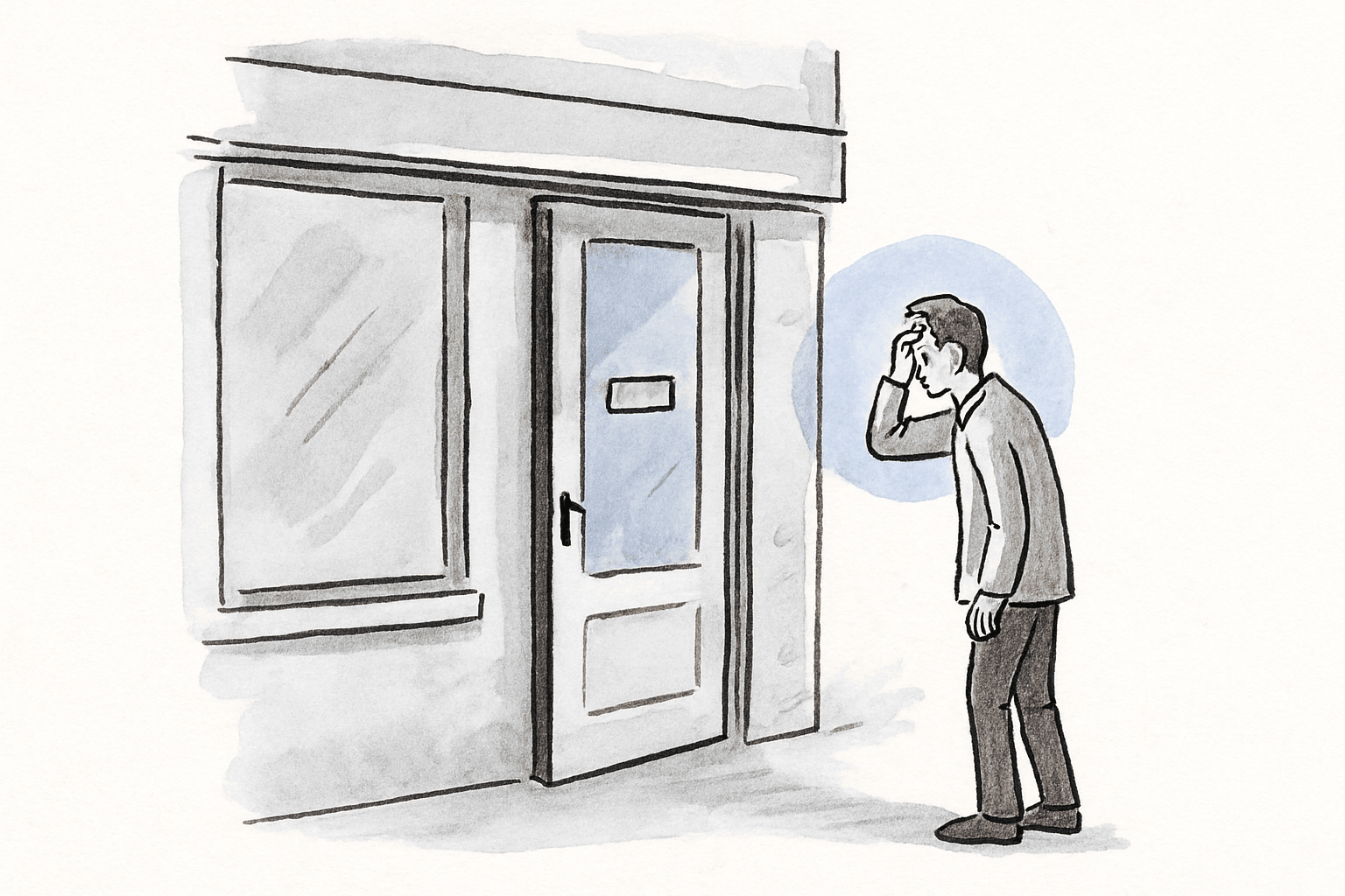
The website did not look broken. It loaded fine, the design was not embarrassing, the information was mostly accurate. But for anyone arriving with the intent to hire the company, it presented an obstacle course where there should have been an open door.
The actual reality: your contact path is a filter, and it is filtering out the people you want
In our experience, the contact path on most established-business websites was designed once and never revisited. It reflects how the company thought about inquiries years ago, not how buyers behave now.
The problem has layers. The first layer is findability: how many clicks does it take a visitor to reach the contact form or phone number? On many of the sites we audit, the answer is two or three clicks from the homepage. That does not sound like a lot. But for a visitor who is still deciding whether this company is the right fit, every extra click is a chance to lose them.
The second layer is friction. Long forms, required fields that are not relevant yet ("What is your budget?"), dropdown menus with categories the visitor does not recognize. Each one is a small barrier. Individually they seem minor. Together they tell the visitor: this company is not making it easy for me.
The third layer is the one nobody thinks about: your website does not signal that you actually want new business. When a visitor scans the homepage and sees no mention of "work with us," no invitation to reach out, no visible phone number, the unconscious message is: this company is not looking for clients right now.
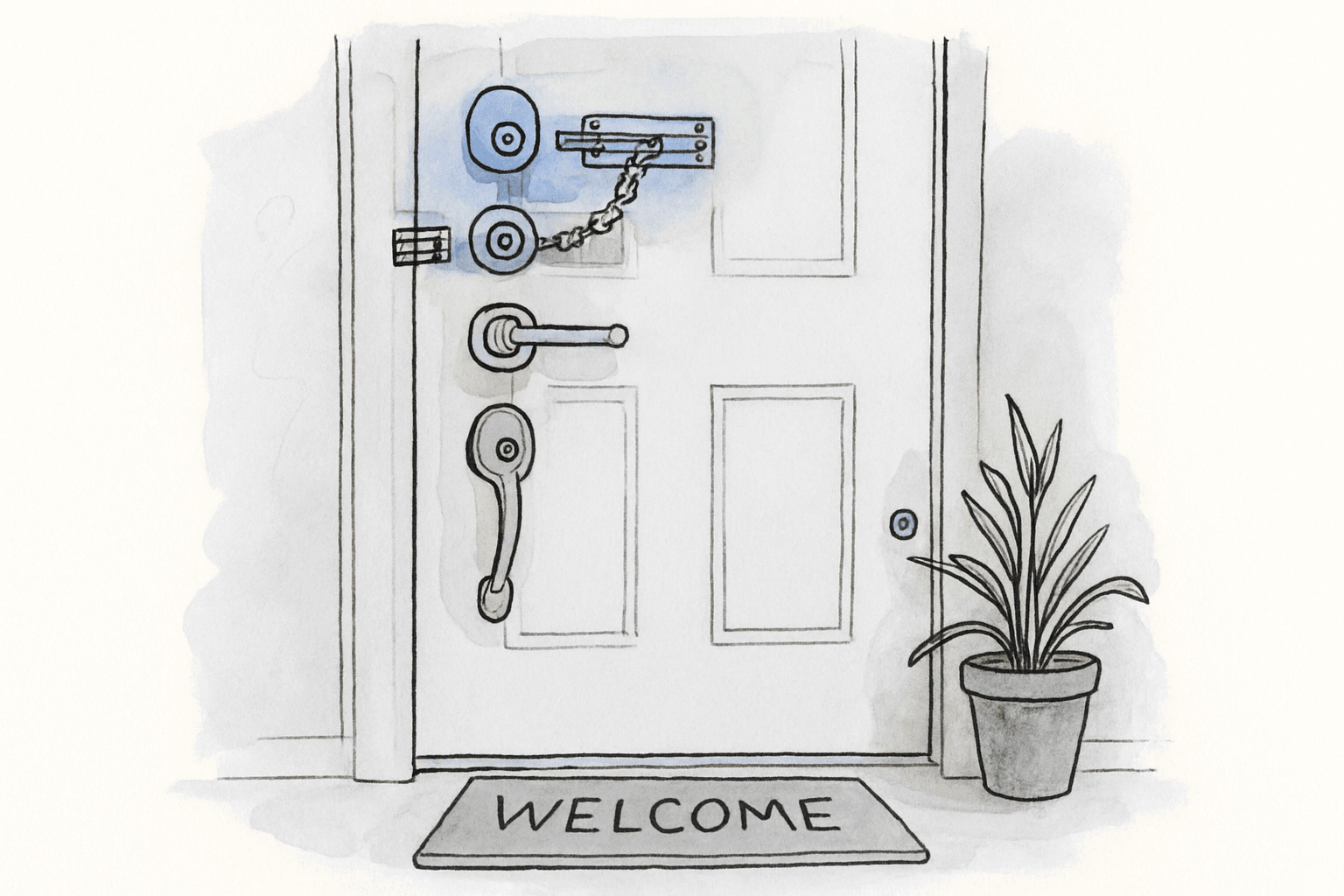
An open door gets more visitors than a locked one with a small sign.
Why this is different from a "conversion optimization" problem
When digital marketers talk about conversion, they usually mean optimizing landing pages for paid traffic: button colors, headline A/B tests, form field reduction. That is a valid discipline, but it solves a different problem.
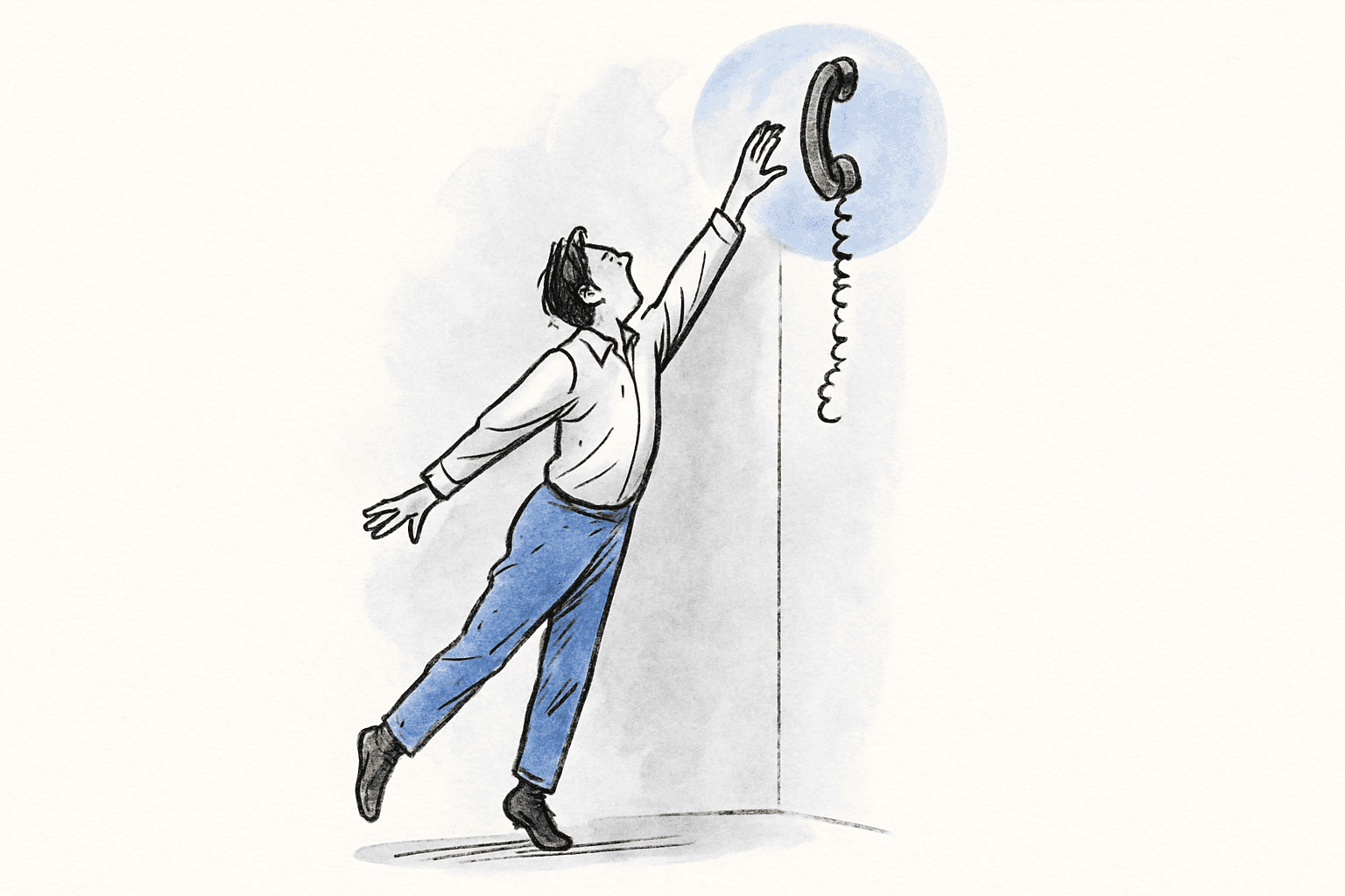
What I am describing is more basic than that. This is not about optimizing a funnel. It is about whether a visitor who already wants to work with you can figure out how to start a conversation. For B2B service businesses, these are often high-value prospects: someone referred by a trusted colleague, or someone who has heard the company's name multiple times over the years. They are not comparison shopping. They have intent. Your website just needs to not get in the way.
The irony is that these are the easiest people to convert. They do not need convincing. They need a clear path.
The most common patterns we see
When we audit established-business websites, the contact-path failures cluster around a few patterns.
Phone number in the footer only. The number is there, technically, but it is in the same visual zone as the copyright notice and the privacy policy link. A visitor has to scroll to the bottom of the page and look for it. Many do not.
Contact form behind multiple clicks. The form exists, but reaching it requires navigating through a menu structure that was not designed with the visitor's urgency in mind. By the time they find it, the friction has chipped away at their momentum.
Too many required fields. The form asks questions the visitor cannot or does not want to answer yet. Budget ranges, project timelines, detailed descriptions of the work. These fields serve the sales process, not the visitor. They turn a first conversation into a job application.
No signal that the company wants new clients. Nothing on the homepage, the services page, or anywhere above the fold says "we are taking on new work" or "here is how to start." The site reads like a brochure about what the company does, not an invitation to work together.
They turned a first conversation into a job application.
Why you cannot see this from the inside
You know how to contact your own company. You have the phone number memorized. You know which email goes to the right person. You know that the form works and that someone checks the submissions. From the inside, the contact path feels obvious because you have never experienced it as an outsider.
There is also a cognitive bias at work. If your business has been getting new clients steadily for years, it feels like the system is working. And it is, to a point. You are getting the clients who are persistent enough to find the path on their own. You are not seeing the ones who gave up.
The owners we work with are not making this mistake because they are careless. They are making it because the problem is invisible. The contact path was set up years ago by someone who is no longer at the company, and it has not been revisited because, from the inside, it seems like it works.
What changes when you fix the path
A client of ours in a specialized service industry had exactly this problem. Good reputation, steady referrals, a site that looked presentable. After we restructured the contact experience (visible phone number, shorter form, clear calls to action on key pages), their inbound inquiry volume went up noticeably. Same traffic. Same referral sources. The only change was that reaching out became easy.
This is not a sophisticated growth tactic. It is basic hospitality. When someone walks into your office, you greet them and ask how you can help. Your website should do the same thing.
The fix is often surprisingly small. A phone number in the header. A simpler form with two or three fields. A clear call to action on every page that says what happens next. These are not expensive changes. They are just the ones nobody thinks to make because, from the inside, the current setup seems adequate.
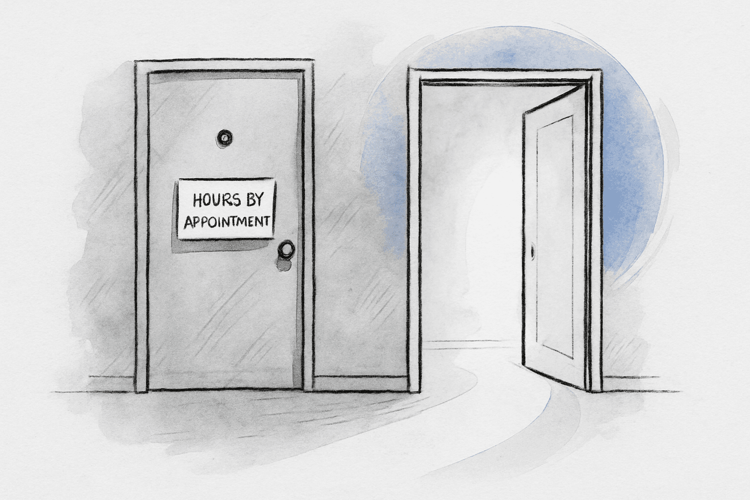
Same traffic. Same referral sources. The door was just open now.
Tests you can run yourself
- 1. Open your website on your phone and try to find the contact form or phone number without using the search function. How many taps does it take? If the answer is more than two, most visitors will not make it.
- 2. Count the required fields on your contact form. If there are more than four (name, email, phone, message), ask yourself whether each additional field is something a first-time visitor can reasonably answer. If they cannot, you are turning away people who are ready to talk.
- 3. Ask someone who has never visited your site to find out how to hire your company. Watch them do it. Do not help. The places where they pause, scroll back, or look confused are the same places where your real prospects are giving up.
What I would actually recommend doing about it
This is one of the rare website problems that can sometimes be fixed without a full rebuild. If your site is otherwise decent but the contact path is buried, a focused set of changes can make a real difference: phone number in the header, simplified form, a call to action on every major page.
If you are not sure whether this is your problem, schedule a call and we will take a look. We will walk through your site the way a first-time visitor would and tell you honestly where the friction is. Sometimes the fix takes a day. Sometimes it takes a relaunch. Either way, you will know.