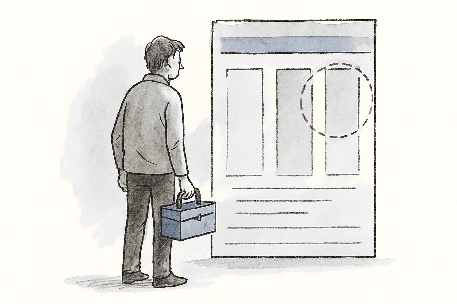
Before our first call with a prospective client, I usually pull up their website. A few years ago, a long-established company in a specialized industry reached out to us. More than twenty years in business, national operations, a company that by any reasonable measure had built something real. I looked at their homepage before we spoke.
The page loaded with their logo at the top, a rotating carousel of project photos, and a headline that was the name of the company. Nothing else below it. No sentence explaining what they built or sold, no description of who their customers were, no obvious next step for someone who had just arrived. The navigation had several items, some of them overlapping, a few linking to pages that had not been updated in years. The business had grown considerably since the site was built. The site had not.
When I mentioned this on our call, the owner paused. He had always known what the company did. It had not occurred to him, not quite that plainly, that someone landing on the page for the first time might not be able to figure it out in thirty seconds.
That is the problem. It is not that established business owners are careless about their company's presentation. It is that clarity becomes invisible from the inside. You load your own homepage and twenty years of context fills in around whatever is written there. The visitor has none of that.
The most common thing we find in a site audit
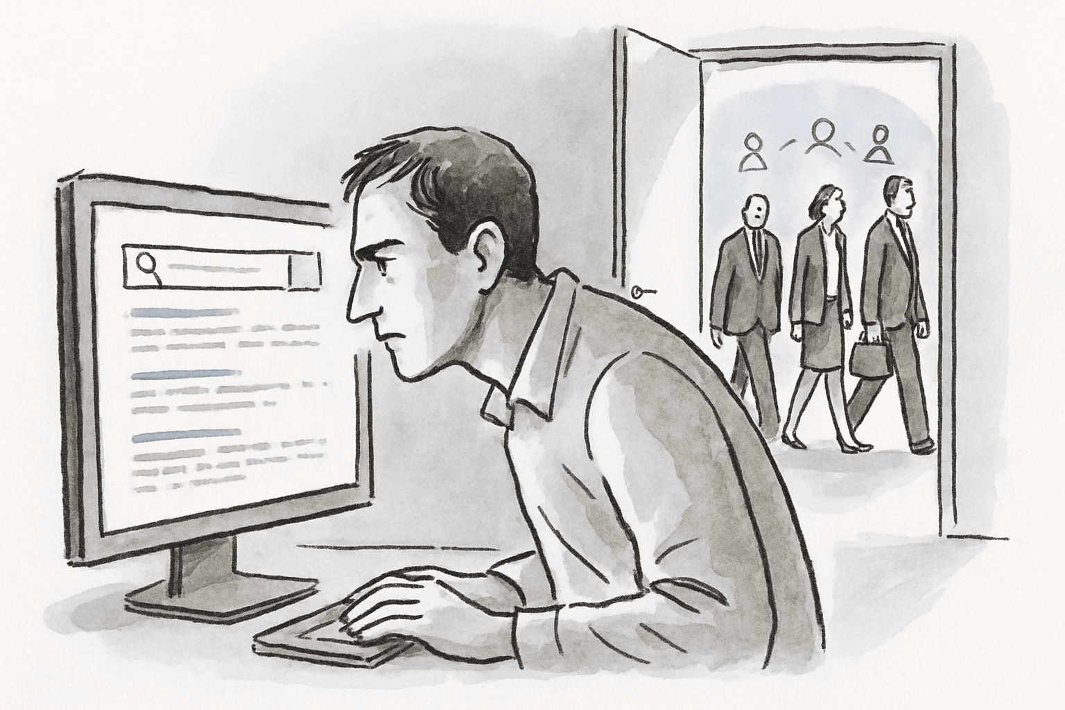
In our experience, homepage clarity is the most common issue we find when we audit an established business website. Not slow load times. Not broken forms. The headline at the top of the page does not tell a first-time visitor what the company does.
The specific failure usually takes one of two shapes. Either the H1 is the company name, which tells you nothing about what the company sells or who it serves. Or it is a vague statement that sounds polished but communicates nothing: 'Excellence in everything we do' or 'Building solutions for tomorrow.' Both fail the same test: a stranger reading it for the first time still cannot tell what you do.
The H1 is the company name. That's it.
A homepage headline that works answers three things quickly: what do you do, who do you do it for, and what should someone do if they want to proceed. Most established business homepages answer none of them, because the people writing the headlines already know the answers.
Why this is a message problem, not a design problem
The typical reaction when we flag a homepage clarity issue is to frame it as a visual question. The page looks dated, so the fix must be a redesign. That framing is understandable, but it is usually wrong.
A new color scheme on a page that still does not say what you do is still a page that does not say what you do. The visitor who could not figure out your business from the original homepage will not be able to figure it out from the redesigned one, unless the words actually change.
The design carries the message. The design is not the message. Fixing the visual without fixing the language gets you a better-looking version of the same problem. Messaging work is also faster and cheaper than a full redesign. A clear, specific headline often outperforms a visually polished page that still leads with the company name.
The most common reasons this keeps happening
When we see this in an audit, it usually traces back to one of three things:
- The original headline was accurate for an earlier version of the business. Ten years ago, the company did one thing and the headline described it. Since then the business has grown, shifted, or specialized. The headline has not moved with it.
- Marketing manages the site without authority over core copy. The owner knows the headline is not quite right, but changing it would require a rewrite, which requires sign-off, which requires time. There is always something more urgent. The headline stays.
- Everyone reviewing the page is already inside the business. The people who read the page before it launched, and who read it whenever a minor update is made, are the people who built the company. They can fill in every gap. The new visitor cannot.
The homepage was written for people who already know you.
Why you can't see this on your own
This is not a question of care or effort. The owner of a business that has been running for twenty years is not inattentive about the company's reputation. The problem is structural: clarity is invisible from the inside.
When you load your own homepage, your brain fills in everything that is not written there. You see the company name and context arrives automatically. You know what the project photos are of, what each navigation item leads to, what the company has done for the past decade. The thirty-second visitor has none of that, and there is no way to simulate not having it while you still do.

The test that surfaces this problem is simple and almost no one runs it: give someone with no prior knowledge of your company the URL, give them thirty seconds, and ask them to describe what you do. Not what they assume. What the page actually told them. The answers are usually uncomfortable, not because the business is obscure, but because the page was never written for that person.
What changes when the homepage finally says what you do
The most striking result after a homepage clarity fix is usually not paid traffic performance. It is inbound contact volume on channels that were already working.
A company we relaunched a couple of years ago, more than twenty years old, national operations, started getting noticeably more inbound contact within months of launch. No ad spend changes. No new acquisition campaigns. No changes to their referral network. The only thing that changed was that people landing on the site could now figure out what the company did, confirm the recommendation they had just heard, and find the path to contact.

The referrals and direct visitors were already arriving. They just had nowhere to go once they got there. A clear homepage closes that leak without adding a single new acquisition channel.
The referrals were already there. They just had nowhere to go.
Three tests you can run on your homepage today
You do not need a full audit to get a first read on whether this is happening.
- Read only the headline. Cover everything else. Does that single line tell a stranger what the company does? Not hint at it. Not imply it. Tell it, plainly.
- Ask someone outside the company. Send them the URL with no introduction. Ask what the company does and what they would do next if they were interested. Their answer will tell you more than any analytics dashboard.
- Count the seconds. Load the homepage and time how long it takes before a newcomer would know what you do and what to do next. If that number is more than ten seconds, something is wrong.
What I'd actually recommend doing about it
If those tests produce uncomfortable answers, the fix may not require a full redesign. In many cases it starts with one rewrite: a clear, specific headline that says what the company does and who it does it for. That single change can be made without touching anything else on the site.
The harder version of this problem, where the homepage needs to be rethought structurally because the current layout cannot support the right message, is a larger project. The way to find out which version you have is to look at it honestly with someone who has not been looking at it for years.
The site audit we run looks at exactly this: what the homepage is actually communicating, whether it matches the business as it exists today, and whether there is a clear path from arrival to contact. We have done this across a wide range of industries and the same gap shows up in almost every audit. Book a free audit and we will tell you plainly what we find.
It costs nothing to find out where the gap is.