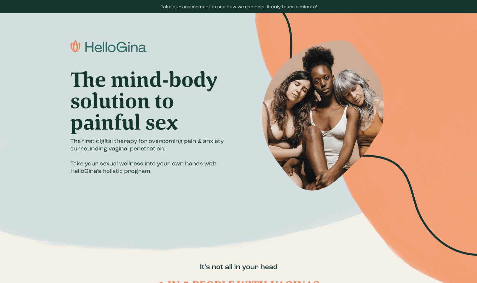
A U.S. launch for a digital health program with nothing like it in the market.

HelloGina, a subsidiary of HelloBetter, came to us to build the site that would introduce their program to a U.S. audience. They had the designs. We handled development, animation, and the mobile partnership that made it hold up across devices.

The short version

HelloGina is a digital health program addressing a common but underserved health concern. They were preparing to launch in the U.S. for the first time, with designs already in hand and a team that would need to own the site after launch. We built it in Webflow, implemented the intricate animations the design called for, worked through the mobile translation together, and trained the team to run it themselves once we handed it off.

A U.S. product launch is a high-stakes moment for any company. The website is the first thing most prospective users will see, and it has to earn trust quickly, convey what the program actually does, and feel like a resource rather than a sales page. For HelloGina, the challenge had extra weight: the subject matter required handling with care, and the brand voice had been developed in German healthcare context before crossing the Atlantic.

HelloGina had the designs ready. What they needed was a development partner who could translate that design into a Webflow build that held up across devices, handled the animations with precision, and left the team able to manage the site on their own after we were done.

What we built.

01

Intricate Webflow animation, built to land.

The design called for animation throughout the site, Lottie files for the illustration work, custom SVG for signature brand moments, and scroll-based interactions that reinforced the warmth of the overall direction. We built it all in Webflow, extending the platform with custom animation work where the defaults couldn’t reach. The animations feel intentional rather than decorative, which was the whole point.

02

Mobile that held up across the translation.

Animation-heavy sites often fall apart on mobile. The motion slows down, the interactions stop working, or the design team ends up cutting everything that was distinctive about the site in the first place. We worked with the HelloGina team to make those decisions together, which animations to keep as-is, which to reinterpret for smaller screens, and which to simplify so the mobile experience still felt like the same brand.

03

Trained the team to own it.

Once the site shipped, we ran training sessions with the HelloGina team to walk them through the Webflow build, how to update content, how to manage the animations, how to add new pages without breaking anything. We also recorded video walkthroughs they could reference later, so the knowledge stayed with the team even as people rotated through the role. They run the site themselves now.

HelloGina launched in the U.S. with a site that matched the rest of their brand and gave them room to grow. The animation work landed as intended, the mobile experience held up across the translation, and the team has been running the site themselves since we handed it off. It became the front door for a new market, the first thing U.S. users see when deciding whether the program is for them.

It was a pleasure working with them. They acted like a true partner and provided suggestions after understanding our goals for the new website.
Daphne Petrich
Country Manager · HelloBetter

Let's build something together.

A 30-minute call. We'll listen, dig into the details, and tell you honestly whether we're the right partner, or point you to someone who is.

Book Intro Call